
Isometric Projection: Perfect for Systematizing and Reusing

FranciscoGyG
18 - 07 - 2023

< Blog | ES | EN

Before isometric projection

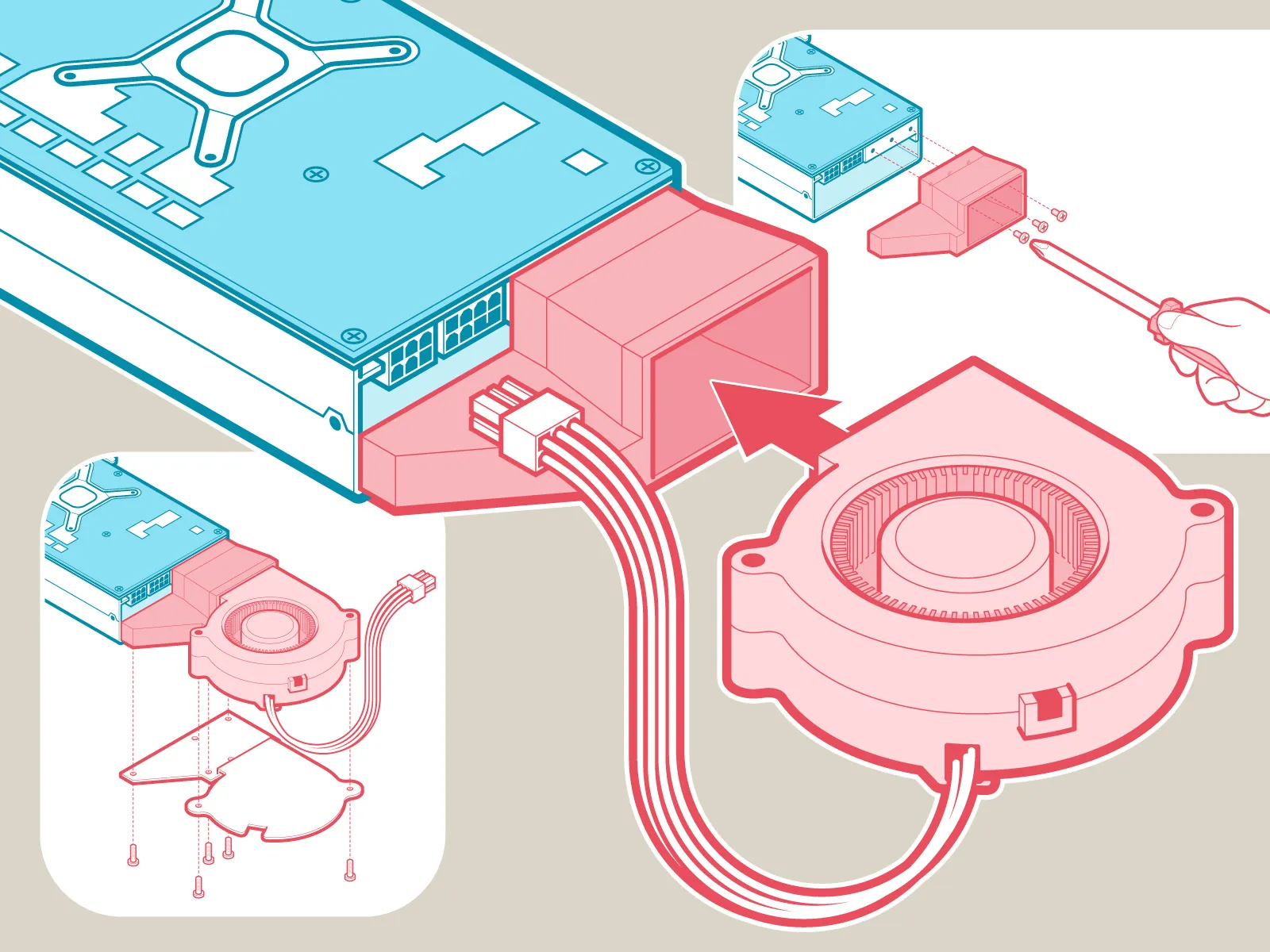
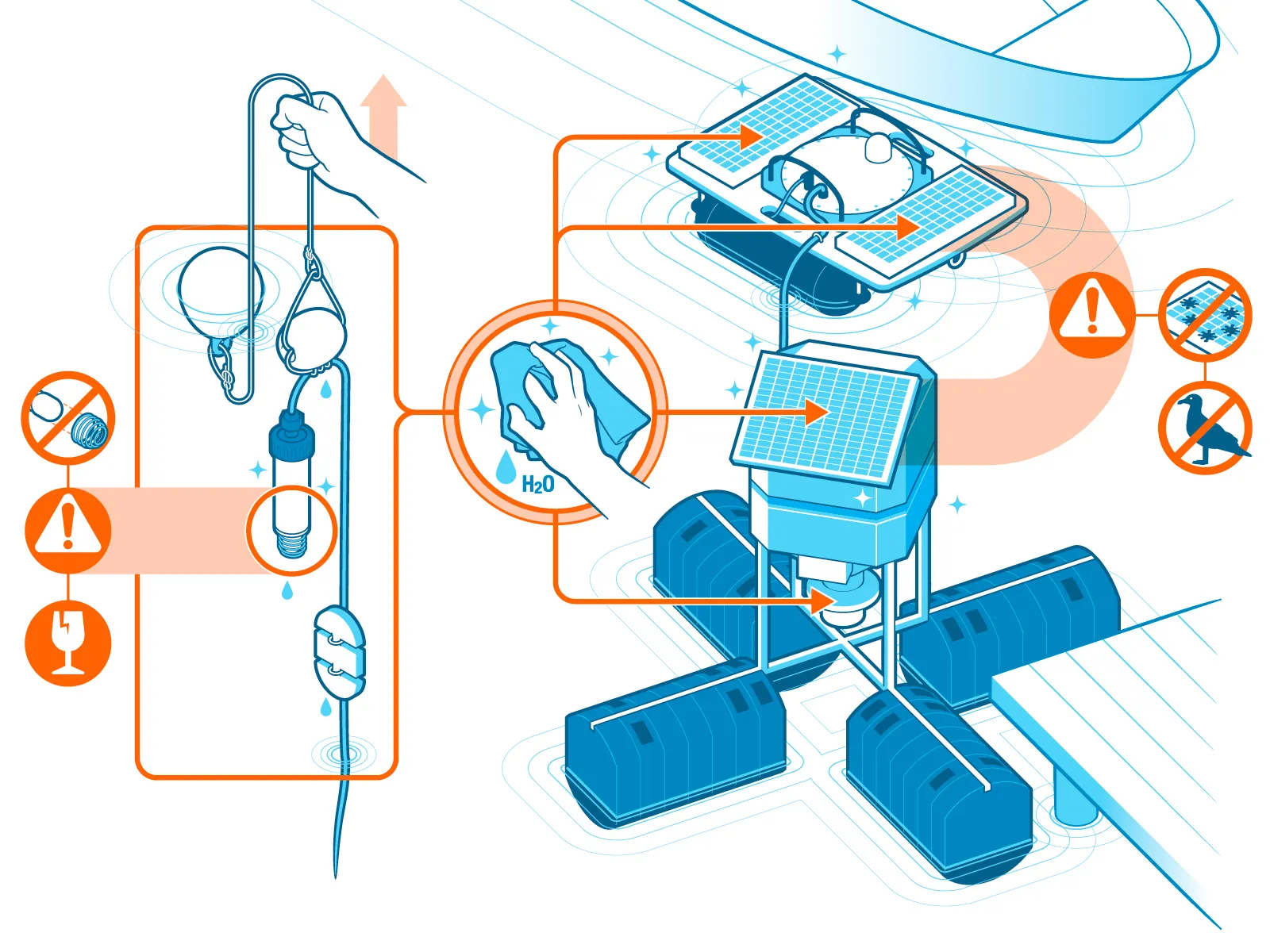
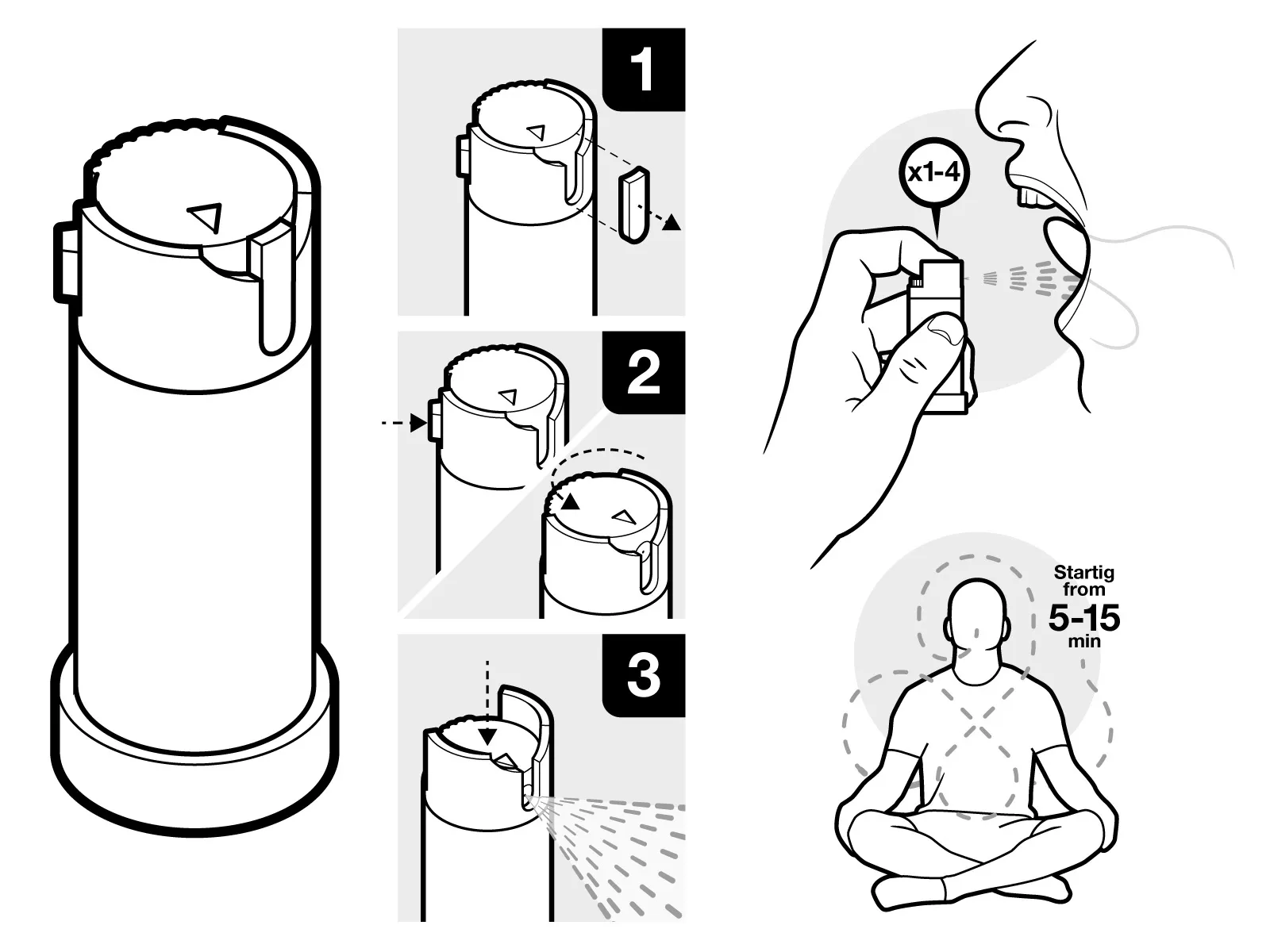
During the first decade of the 2000s I worked as an illustrator and infographic designer for different general interest, science and technology magazines, such as Popular Mechanics. My first works did not follow an isometric projection.

ES: Algunas colaboraciones para la revista Popular Mechanics en español. ES: Some collaborations for Popular Mechanics magazine in Spanish.

The workload varied, but I usually did 3 to 5 monthly collaborations. Each one took a week to make, so I used to spend the entire month thinking about ways to work out an illustration or infographic.

ES: Algunas colaboraciones para la revista Popular Mechanics en español. ES: Some collaborations for Popular Mechanics magazine in Spanish.

How to simplify so much work?

It was definitely a lot of work.

At that point, I became obsessed with finding ways to make my process more efficient. Vectors were very useful for this, but there had to be a way to simplify, systematize and save energy in the elaboration of vector shapes.

My first illustrations had no particular grid; each one had its own perspective, with two, even three vanishing points. The problem was that they could hardly be reused in the same or other projects.

ES: Ilustración vectorial de la Sede de la Televisión Central de China con sus puntos de fuga parpadeando. EN: Vector illustration of the CCTV Headquarters with its vanishing points flashing.

Isometric projection was here to stay

I started using the isometric grid in mid-2005, mainly to explore that style of illustration, which I had always liked. I quickly realized that it allowed me to generate elements with a uniform structure and reuse them over and over.

An example: the following illustration of a wrench, which I made starting from a vanishing point.

ES: Ilustración vectorial con punto de fuga de una llave combinadas de carraca. EN: Vector illustration with vanishing point of a ratchet combination wrench.

Nice, isn’t it? But there is a problem: if I wanted to reuse the lines of this wrench in the same project… then it doesn’t look so good anymore.

ES: Ilustración vectorial con diferentes puntos de fuga de un juego de llaves combinadas de carraca y las líneas guía de uno de los puntos de fuga. EN: Vector illustration with different vanishing points of a set of ratchet combination wrenches and the guide lines of one of the vanishing points.

To correct this, a second wrench would have to be drawn from the vanishing point of the first; that is, all the necessary wrenches would have to be drawn again, with a common vanishing point.

Similarly, if I wanted to reuse the lines of the wrench in a new project, it would need to have the exact same vanishing point, located in the same position as the previous wrench. In other words, the new work would have to adjust to a framing and perspective that were randomly determined in a previous, unrelated work.

That simply makes no sense, so in order for the wrench to fit, I would have to trace it with the perspective of the new project, completely ruling out the possibility of reusing the lines from the first wrench.

Alternatively, if the same wrench had no perspective whatsoever and was done in an isometric grid (like the following):

ES: Ilustración vectorial isométrica de una llave combinada de carraca. EN: Isometric vector illustration of a ratchet combination wrench.

Then we definitely would be able to use the same lines, as many times as we wanted, in the same project or in other contexts, as long as they were also done in an isometric grid. Sure, small adjustments would be necessary, but it would take a lot less time and effort than drawing the wrench from scratch again and again.

ES: Ilustración vectorial isométrica de un juego de llaves combinadas de carraca y sus líneas guía. EN: Isometric vector illustration of a set of ratchet combination wrenches and their guide lines.

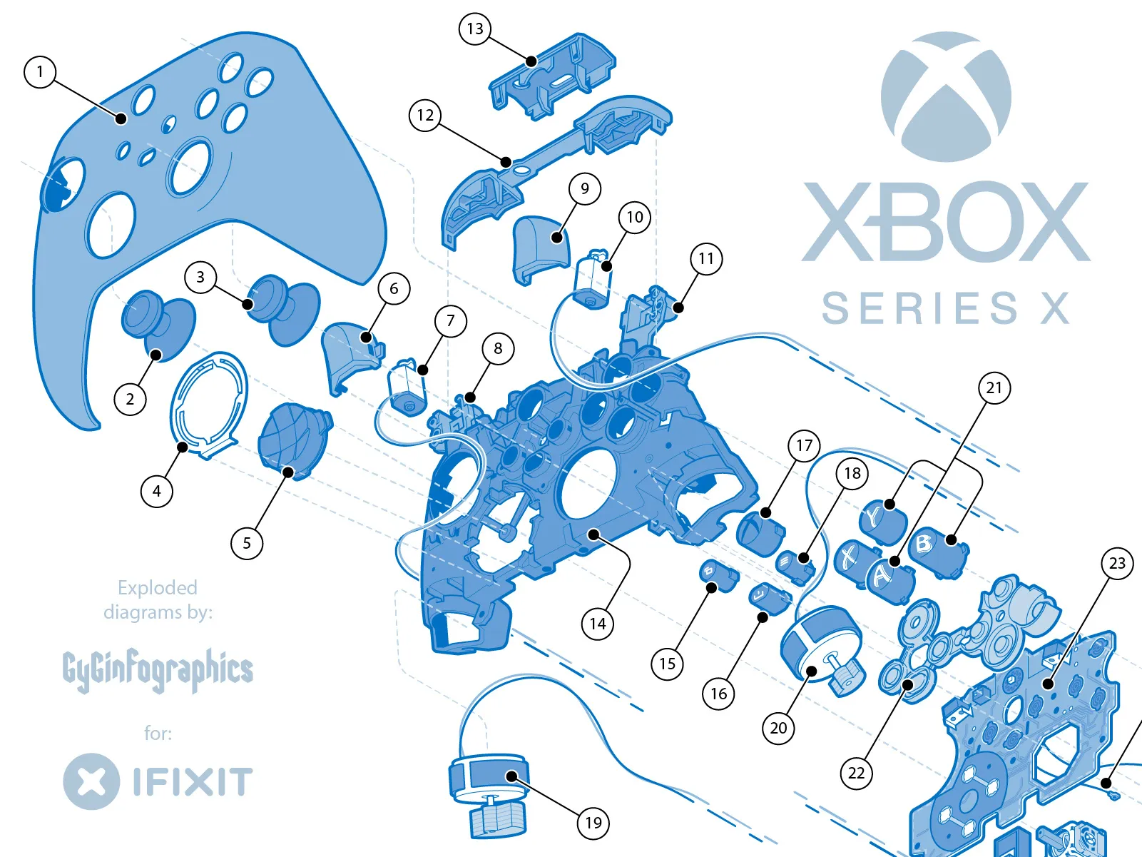
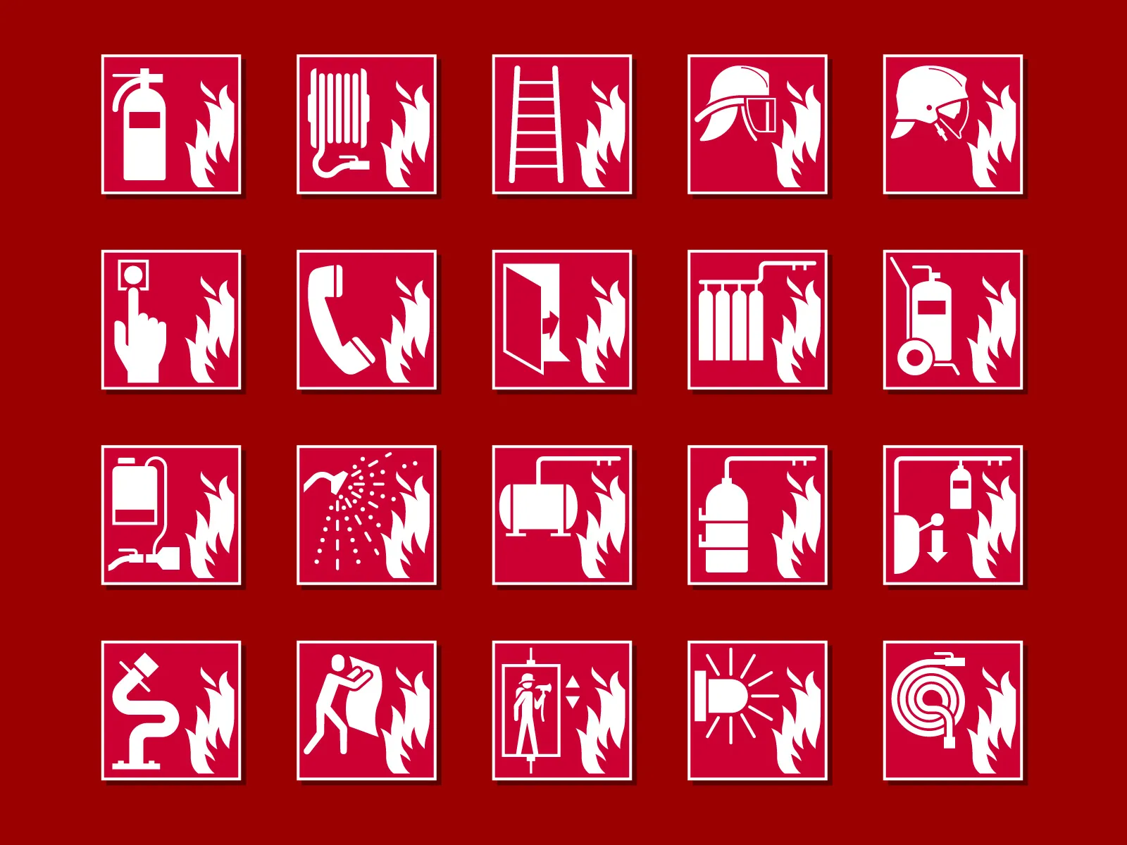
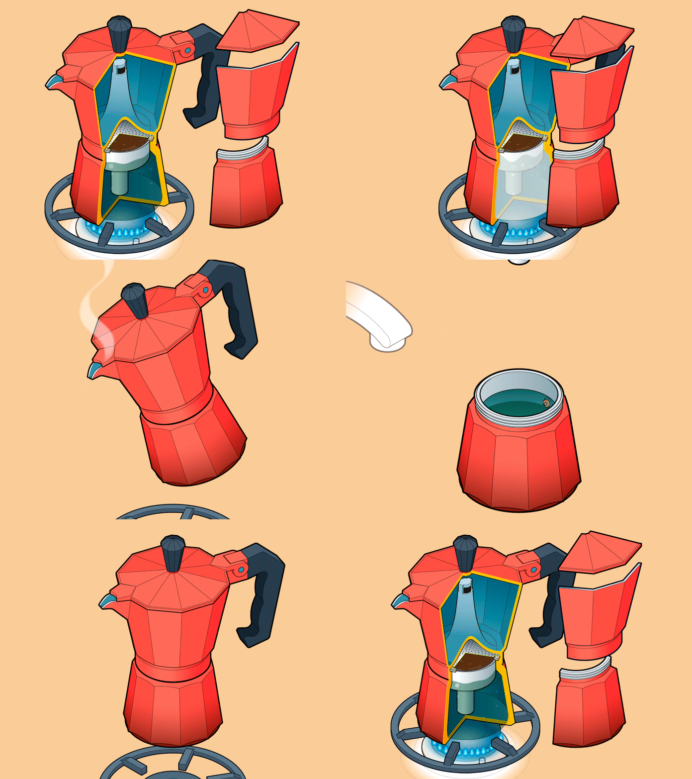
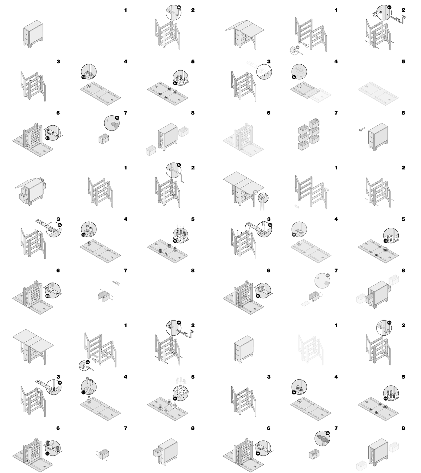
Over time, I polished and perfected my technique to work my illustrations in an isometric space, until I was able to systematize the different processes that I use to draw and create figures, to such an extent that isometric projection has been a hallmark of my work for years now.

What do you think? Has a process improvement ever impacted your work style?

Thanks for reading and sharing.

Francisco GyG
Translation: Aron Covaliu.

Vector Craftsman

Vector Craftsman

I reflect on my creative process as a digital artisan, weaving with vectors to achieve high quality images. In this article, I explore how care and precision in vector handling can make a big difference in the final design.

leer más
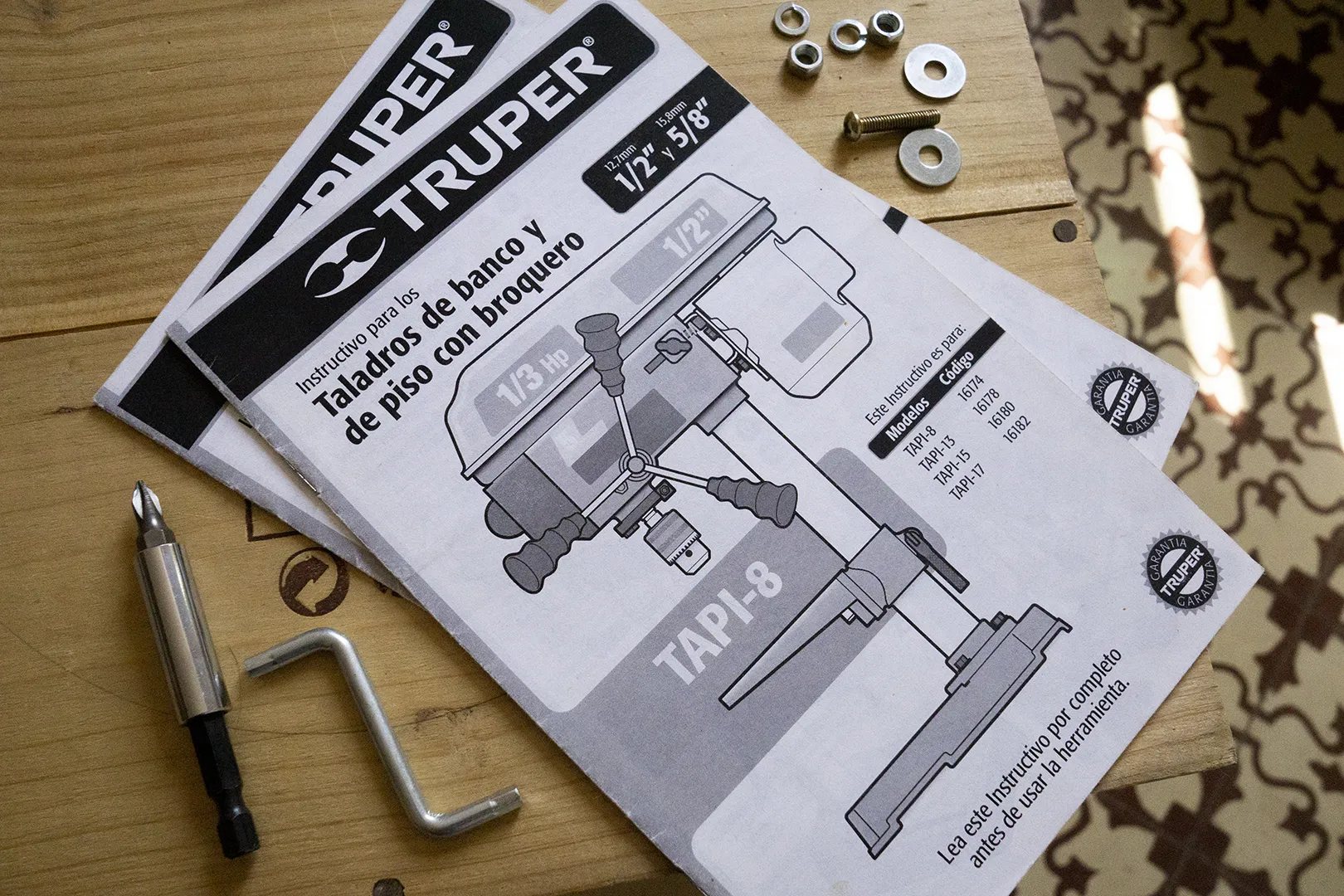
Truper Manuals (I)

Truper Manuals (I)

How and why I started developing the instruction manuals for Truper, the largest tool manufacturer in Latin America. A story of entrepreneurship for freelance designers and illustrators.

leer más
0 comentarios

Enviar un comentario

Tu dirección de correo electrónico no será publicada. Los campos obligatorios están marcados con *