That’s right. Line thickness matters!
One of the most important elements of a technical illustration is, without a doubt, line quality (also known as stroke weight). This detail, however, is often overlooked, and being the detail-obsessed technical illustrator that I am, it annoys me every time I see it.
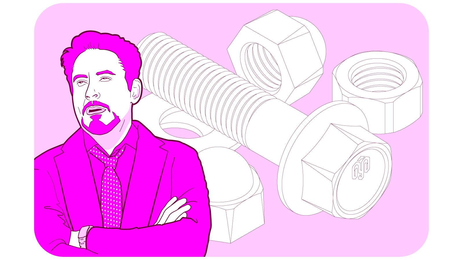
Line quality? Do lines have qualities? And can their quality actually vary?
Sure it can. Lines have different qualities, that is, thicknesses. And although some are more visible than others, they are all equally valuable. Knowing how to use them harmonically when creating a technical illustration is what the concept of “line quality” refers to.
The purpose of line quality
A proper technical illustration includes different stroke weights, and each one has a function. They are not there by chance. Together, they have a specific purpose beyond just aesthetics:
Structuring the flow of communication with which the elements of the illustration are perceived by the reader.
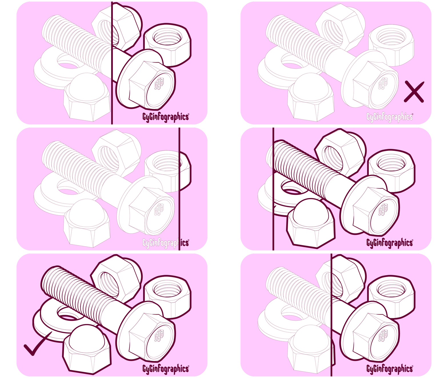
Without the right line quality, technical illustrations can be confusing, as they lack the versatility that different thicknesses provide to emphasize the relevant details that give the elements of the illustration a structure and purpose.
Imagine seeing a play in which the actors wear no makeup: from your seat, the emotions in their faces will be hard to make out without the aid of some makeup to highlight eyes, eyebrows, mouth, cheekbones, and so on. The same happens with the elements of a technical illustration.
Applying line quality
So how does one work the line quality? There are no strict rules, but I can share the process I use to add thickness to the lines of my vector illustrations and, while I’m at it, explain their role in five steps.
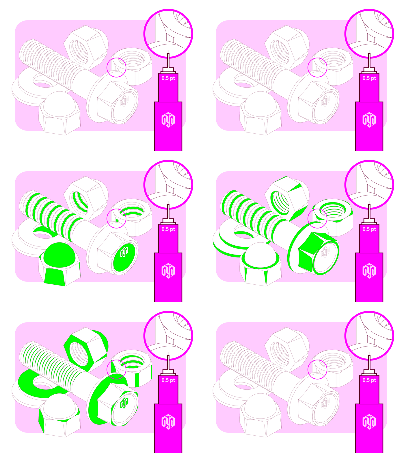
A) First stroke, 0.5 pt
I start by tracing the entire illustration with the weight that I chose for the finer details of the image; in this case 0.5 pt.
It is not uncommon to find illustrations that don’t go beyond this first stage, using the same thickness for all the strokes and resulting in a lack of a defined hierarchy, with no contrast, planes or defined objects.
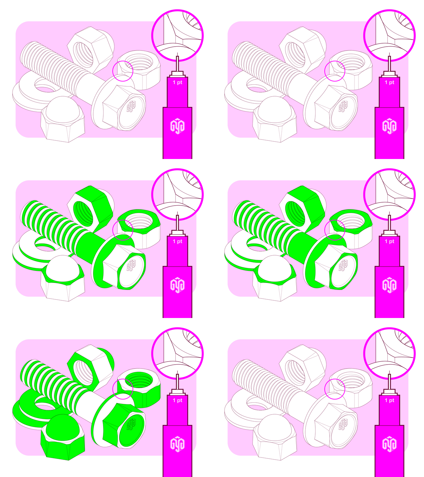
B) 1 pt stroke
This is where I begin to apply line quality. I select certain lines and increase their thickness to 1 point in order to highlight the basic shapes of the objects. Now, with only two thicknesses, you can already notice a certain structure in the elements of the illustration.
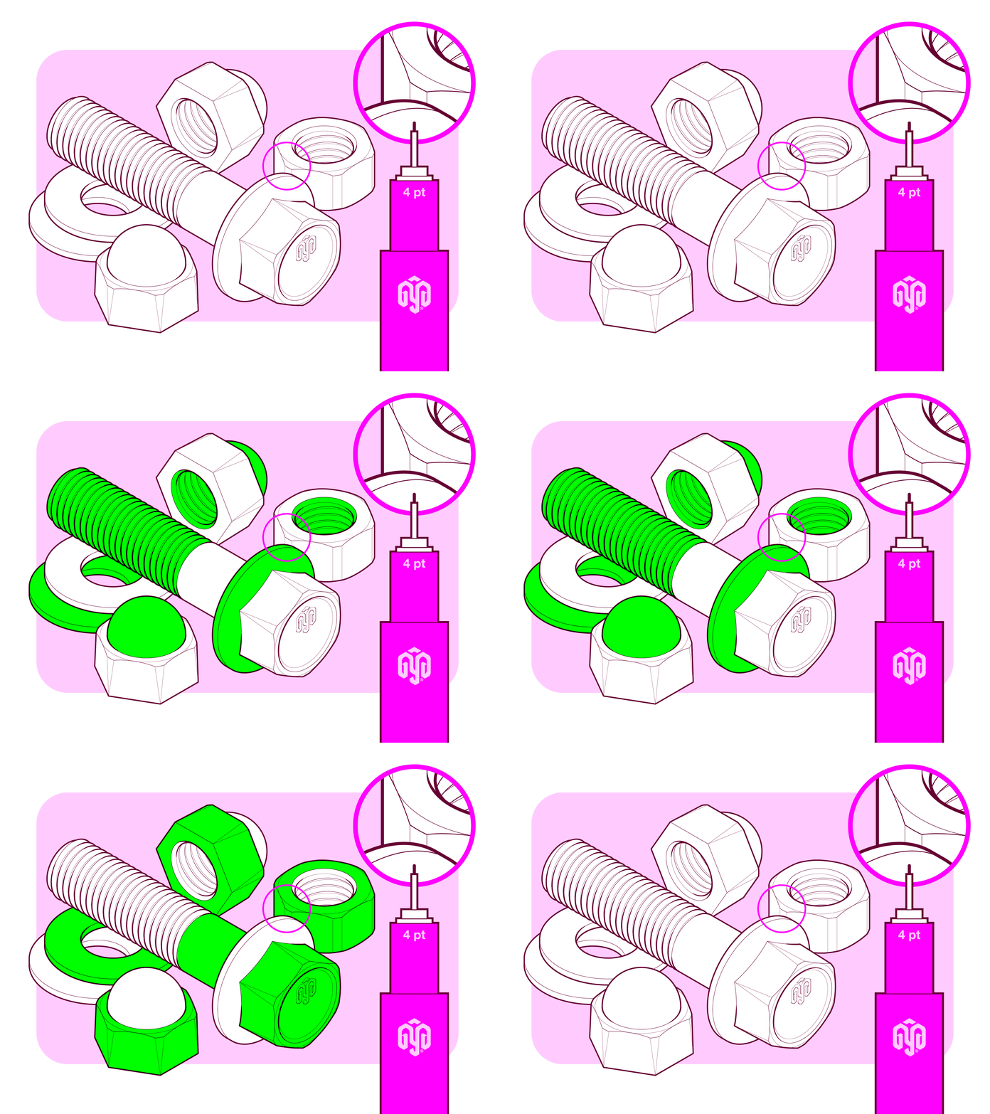
C) 4 pt stroke
To outline the main bodies of the illustration, I change their thickness to 4 pt. Now, every object is clearly defined: they are no longer flat figures, as was the case when the weight of all the lines was 0.5 points.
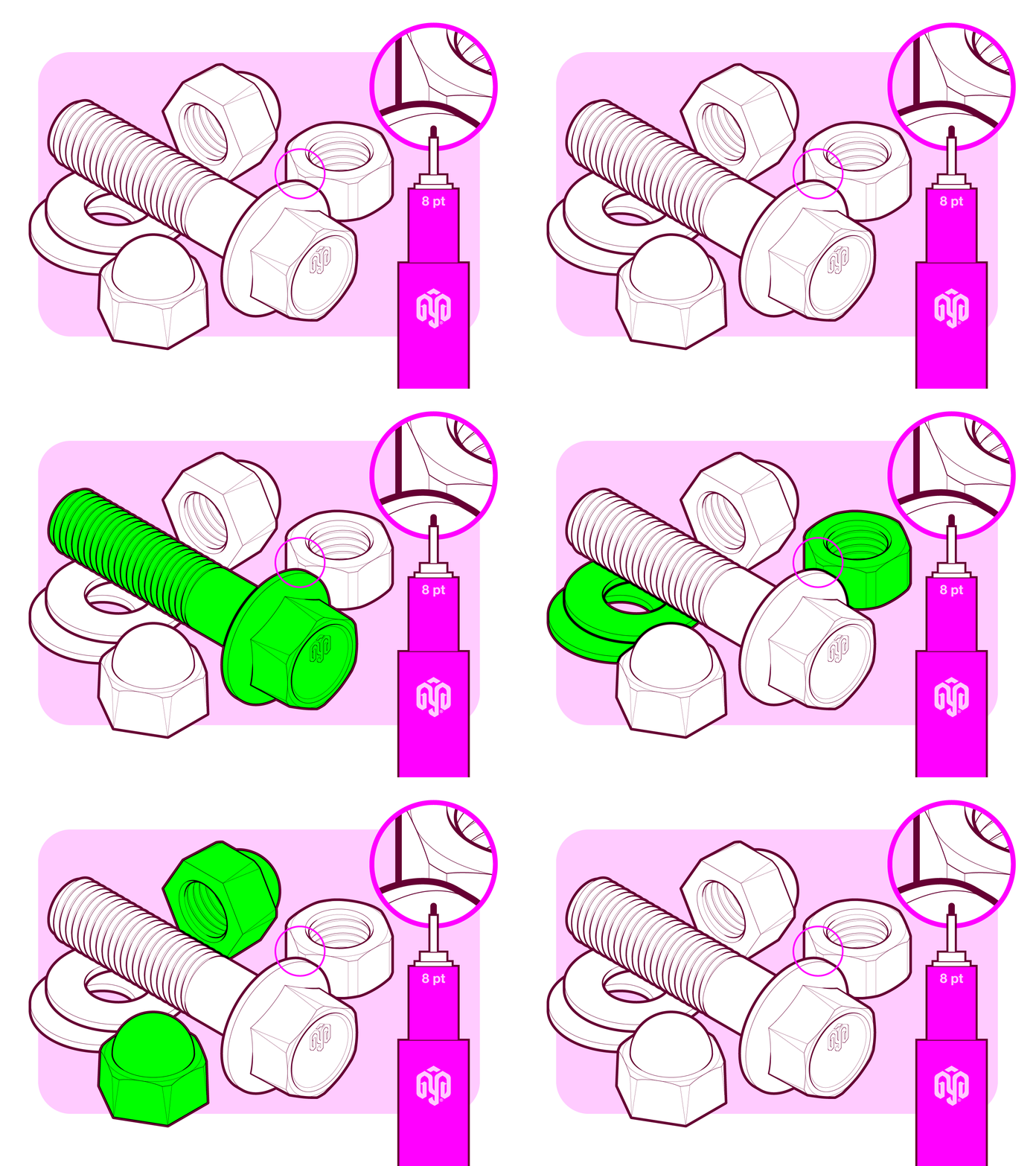
D) 8 pt stroke
It is time to outline all the objects so that every single screw, nut and washer is properly delimited with an 8 point line.
E) 12 pt stroke
Finally, I use a 12 point stroke so that everything is perceived as part of the same set.

That’s it! We just applied line quality to our illustration.
Things I keep into account during the process
- Number of weights
- The structure of the illustration
- The final size of the illustration
- A gradual increase in thickness
Number of weights
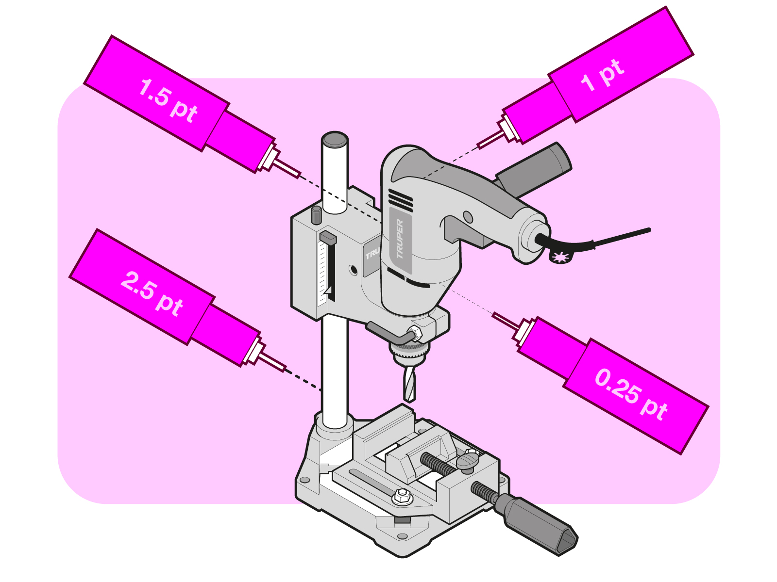
Less is more. I don’t want things to get out of hand, so I choose the weights that I will use before I start working on the illustration. For example, in the illustrations I do for Truper‘s instruction manuals, I use four weights, never more and always the same; in this way, I make sure all the images will be consistent.
Structure of the illustration
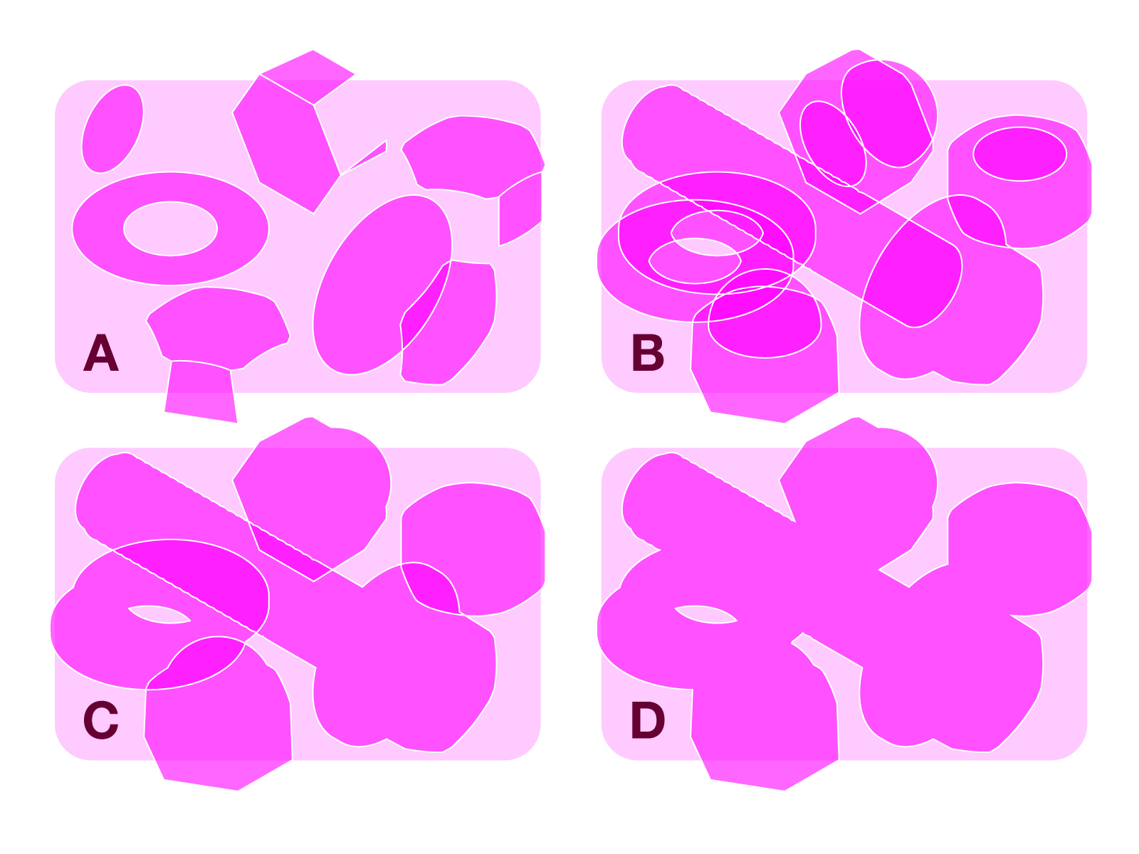
Here, I identify the elements that make up the illustration: basic shapes (A), volumes (B), objects (C), and sets (D). Each element plays a role in the illustration, and I assign a weight to each one, depending on what it’s supposed to describe or convey.
Final size of the illustration
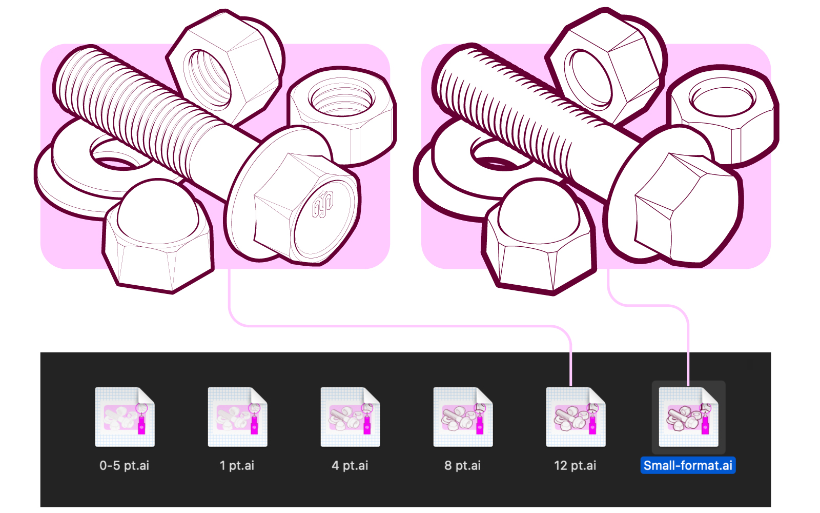
It is important to take into account the final size of the illustration, especially if they will be used at very small scales. If that is the case, I use fewer weights, increasing the contrast between them and removing any unnecessary strokes that would just make it confusing.
A very clear example can be seen when comparing the following 64 x 64 pixel icons, where the sharpness of the “small format” icon is quite clear, unlike the others.
Gradual increase in thickness
I always start working with the thinnest weight among those I previously chose. Once I finish drawing, I select certain lines to increase their thickness gradually.
Result
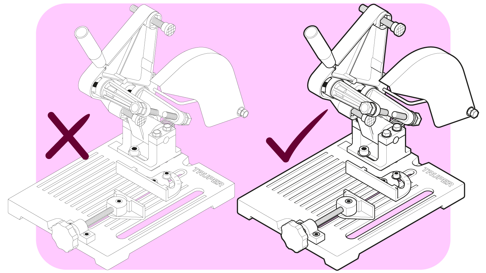
An illustration with different stroke weights says much more than one with just one. This becomes especially noticeable in more complex and elaborate illustrations, where the amount of detail can be overwhelming if the different elements are not organized in a hierarchy with the help of line thicknesses.
Common mistakes (and how to deal with them)
Some common mistakes people make when working with line quality that make it difficult to understand technical illustrations are:
- Lines too thin for medium and large formats.
- Lines too thick for small formats.
- Sloppy scaling of graphics.
- Lack of structure when applying line quality.
- Lack of uniformity among illustrations.
Lines too thin for medium and large formats
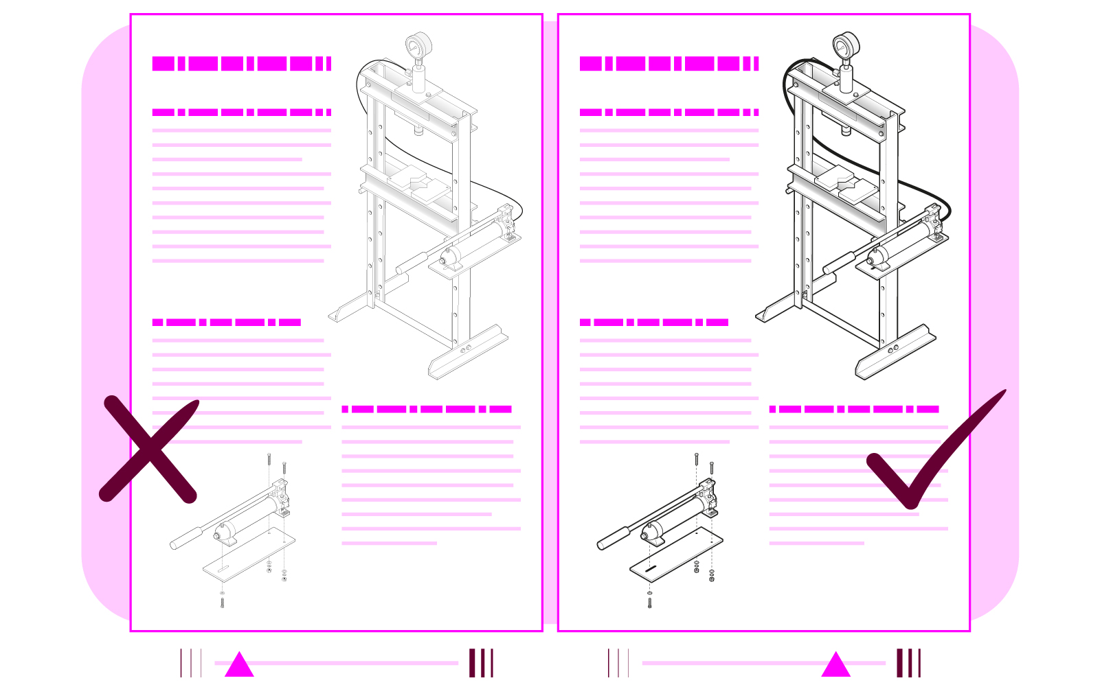
- Problem: A pale illustration which risks disappearing from the viewer’s sight.
- Solution (in Adobe Illustrator):
- Select the entire image and open the Scale tool (S + ↵).
- Check the “Scale Strokes & Effects” box.
- Increase the image size by 200% and click OK.
- Without losing the image selection, open the Scale tool again.
- Uncheck the “Scale Strokes & Effects” box.
- Reduce the image by 50% to make it return to its original size; now its strokes are twice as thick.
Lines too thick for small formats
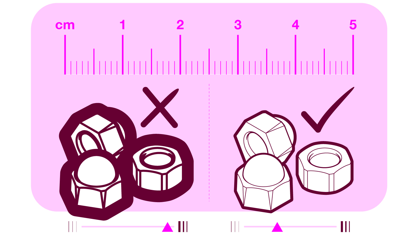
- Problem: A confusing illustration with plastered details.
- Solution: Apply the previous procedure, but in reverse. Reduce the size of the image by 50% with the “Scale Strokes & Effects” box checked; then increase the size of the image by 200% with the same box unchecked (if the original image is too small, you may need to adjust it later).
Sloppy scaling of graphics
I could write an entire article about this. For now, I will only say that, although vector illustrations have the ability to be scaled without losing quality –as I mentioned in the article “Vectors vs Pixels”– it is important to consider that the scale of the thicknesses of the lines is not necessarily proportional to the scale of the illustration; therefore, I always make sure that the weights have the attribute of being scaled proportionally to the size of the illustration. In this way, the line quality of my illustrations maintains the correct proportion, regardless of their size.
- Problem: This causes the two previous mistakes – lines too thick or too thin for the formats in which the illustrations are being used.
- Solution: Knowing how to use the “Scale Strokes & Effects” box, depending on the circumstances and being aware of its effects.
Lack of structure when applying line quality
The line thicknesses don’t have a logical order, making the illustration seem like it was made from pieces of several others.
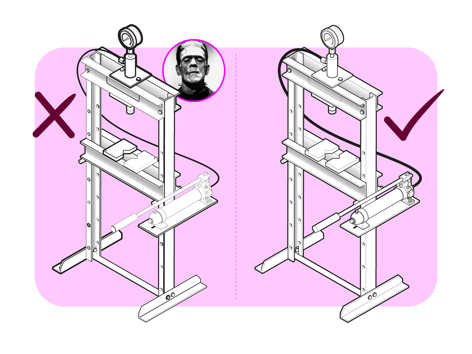
- Problem: A confusing, messy illustration.
- Solution: Organize the elements in a hierarchy, in order of importance, to give each one the appropriate weight.
Lack of uniformity among illustrations
This happens when two or more illustrations with completely different line qualities are used in the same document.
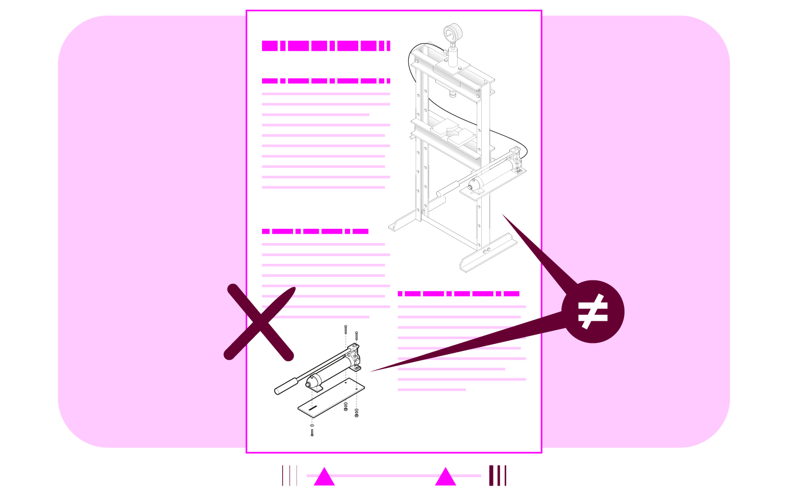
- Problem: A lack of uniformity in documents where continuity in the design line is very important.
- Solution: Use the same line quality from the beginning, and when objects have similar dimensions, always scale them at the same time and in the same proportion.
Conclusion
It is not uncommon for many people to ignore or disregard these considerations, but trust me; this is not a matter of one image looking “prettier” than another. The point is that they have the right characteristics so they can function as a visual tool that guarantees the understanding of an instruction or procedure, and one of the most important is, without a doubt, line quality.
Would you have guessed all that’s behind the thickness of the lines of a technical illustration?
Thanks for reading this far. It would be a big help if you share this with others whom you think may find this helpful 😉.
Francisco GyG
Translation: Aron Covaliu.
