Notice:
I have been working with pixels for two decades, so the outcome of this match may be biased.
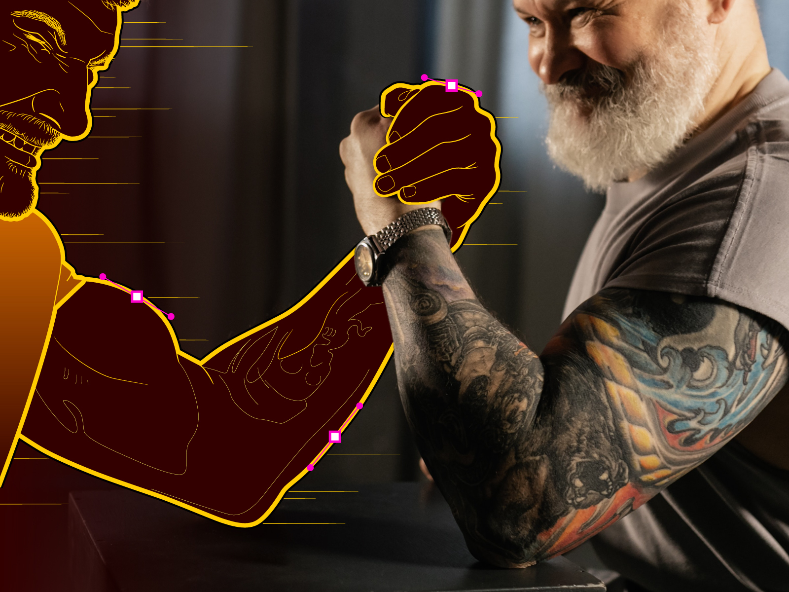
Before jumping into the matter, I must say that in order to bring this epic fight to life, I took the liberty of intervening a photograph from the free stock photo site Pexels, by the talented photographer Alena Darmel. Please make sure to take a look at her work here.
Now, let’s get ready to rumble!
On the left we have the vectors; on the right, the pixels. At first glance, the vectors seem to be at a disadvantage, given the obvious ability of the pixels to reproduce textures, details, colors, atmospheres and more.

The pixels know it, and they are confident in their victory.
The first round begins and things look easy for the pixels. Or do they? The vectors seem to react; they will not be defeated so easily.
Don’t believe it? Look closely: it is precisely 12:15 and 32 seconds, the exact moment when the vectors start to react!
You may wonder, how does he know the exact time of the vectors’ reaction?
Easy: it’s the time on the wristwatch of the pixel fighter. Right? Can you make it out in the following video? You can’t? Fortunately, the one the vector fighter is wearing looks fine:
Their ability to be scaled and achieve this zooming effect without losing quality is conclusive. Point for the vectors!
Many might think: “Hey! This is unfair. No one knew the judging criteria for this encounter.” Yes, I admit it, but what did you expect? This is my first post and I can’t let the pixels win with the love I have for vectors.
To be a bit fairer and prevent any further suspicion, I will explain the judging criteria that we’re using in this fight:
- Round 1. Ability to be scalable (an indisputable point for the vectors).
- Round 2. Precision of the line.
- Round 3. Ease of editing.
- Round 4. Ability to be reusable.
- Round 5. Ability to be animated.
- Round 6. Ability to be programmed.
- Round 7. Storage size.
That said: on with the fight! The first round took us all by surprise. Let’s hope the next ones are just as exciting.
Round 2: Precision of the line
In the second part of the match, the hostilities continue to concentrate in the watch area. The pixels are upset after having lost the first point, and will desperately try to even the score.
However, they don’t succeed. Unfortunately, they depend on the hand of the illustrator (that is, me) and, although the result is acceptable, we cannot forget that precision is what’s being assessed in this round.
The second round goes to the vectors!
Round 3: Ease of editing
We’re well into the match now. On the vectors’ corner, the decision is made to take advantage of the head-start and show off a bit more. They want to display their strength! To do this, it is necessary to edit them, an action that will require a few seconds.
There! They knew that the pixels would have taken much longer to produce a convincing edit. Point for the vectors!
Round 4: Ability to be reusable
We’re halfway through the match and the vectors have decided to hand out copies of themselves among their fans. The crowd goes wild when they receive a wide variety of products in which vectors are masterfully applied, regardless of scale or substrate and without losing quality!
What a thrilling moment, friends! With this action, the vectors win the round almost without trying.
Round 5: Ability to be animated
At this point, the vectors seem to have the match in their pocket. But they shouldn’t be overconfident: the ability to be animated is put to the test here, and the pixels have come a long way in this area. However, the vectors seem to have an ace up their sleeve and… yes! They are going to use it: motion graphics.
This strategy catches the pixels by surprise; they know they lack that attribute. However, they still flaunt their ability to be animated in a mind-blowing display of moving effects, details and textures.
Or not… After much debate, judges award victory to pixels by split decision, arguing unnecessary rudeness on the part of vectors.
The pixel fans celebrate! But we must not lose sight of the fact that the pixels had to use many resources for this round and seem exhausted after making such a big effort, while thanks to the optimization of resources, the vectors remain fresh, thanks to resource optimization with motion-graphics.
Round 6: Ability to be programmed
We are reaching the outcome of this match and the vectors show no signs of wear. They don’t seem to care much about the result of the previous round. In fact, it would almost seem like it was a strategy, in anticipation of this round, where the ability to be programmed must be displayed.
The vectors quickly resort to XML language to become SVG. This gives them an advantage, as now they can be viewed in any browser and can be controlled and manipulated through code.
Take another look at the hands of the wristwatch: their vectors have been programmed with CSS to move like the real thing! The pixels don’t stand a chance here, folks. This is a massacre!
See the Pen SVG Watch by Francisco Javier González y García (@GyGInfographics) on CodePen.
See the Pen SVG Watch by Francisco Javier González y García (@GyGInfographics) on CodePen.
The sixth round ends before it becomes a tragedy for the pixels. Another point for the vectors!
Round 7: Storage size
We have reached the final part of the match. Some pixel fans are starting to leave before the last encounter begins.
There’s no doubt that the pixels are worn out. Carrying their own weight in a battle against such a formidable opponent has been exhausting. Unlike sports matches, where the opponents lose weight as the event goes on, in the world of digital images and graphics pixels and vectors must multiply to unleash their full potential.
Vectors and pixels entered the competition weighing in at 183 KB and 1,2 MB, respectively. Now, in the seventh round, the vectors carry 1,35 MB while the pixels have accumulated a whopping 137,8 MB. This, folks, gives the final point to vectors as well as the undisputed victory over the pixels.
The crowd goes wild! Even pixel fans are celebrating the outcome of the match! What a thrill!
Conclusion of the encounter Vectors VS Pixels
Before this gets completely out of hand, I must confess that it may not have been a fair battle. Had the judging criteria been different, surely the vectors wouldn’t have stood a chance against the pixels. But I thought this was a great opportunity to showcase the attributes that define vectors, which are the raw material I use every day for my illustration and design projects. These are all the reasons why I prefer vectors to such an extent that on social media I define myself as a vector craftsman.
However, my work would not be possible without the support of the pixels, so as head of the jury, I declare this a technical tie!
In another entry I will talk about them as allies instead of opponents; don’t miss it.
In summary, these are the seven qualities of vectors that I put to use every day:
1. They can be scaled without losing quality.
I don’t like to worry about unnecessary matters, like the scale of my graphics and illustrations. Vectors allow me to make them as big or small as required. True, there are some factors I must take into account to avoid unpleasant surprises, but it’s a capability that pixels simply cannot offer.
2. They can be traced with mathematical precision.
I am pretty flexible for many things, but for others I can be quite obsessive. An example of the latter is the quality of the lines of my illustrations. I need to have absolute control of each line, and the coordinate system of vector drawing is great for that. This would not possible in a pixel situation, where accuracy would depend entirely on the skill of the hand that draws.
3. They can be easily edited.
Once drawn, they can be edited to fit different requirements; you don’t need to redo them or go through an elaborate retouching process, as is often the case with pixels. This saves a lot of time and makes my work easier, to such an extent that instead of being annoyed by any art direction adjustments, I take them as a chance to improve my work without having to put any extra effort.
4. They can be reused indefinitely.
I don’t like to work twice on something that I know I already executed. Reusing vectors yields precious time that I can use working on other projects or polishing my work. Also, the file formats they accept don’t alter the quality of the graphics. If I worked with pixels most of my material would be single-use, and I would have to be extremely careful with the formats to avoid losing quality.
5. They can be animated (motion-graphics).
It took me a while to discover the possibility of controlling the time with which vectors are transformed, but I’ve been perfecting it from the start. It was amazing to discover that all the material I had accumulated over the years could be brought to life thanks to After Effects. If I wanted to do the same with my image files, I would have to redo them for the specific purpose of animating them.
6. They can be programmed (SVG and Lottie files).
Peeking into the entrails of my graphics to access the code is both exciting and rewarding. I noticed that in order to modify or control them by code it is essential to have all the elements of my illustration (layers, anchor points, sets, fills, borders) properly ordered, without leaving any to chance. With this code you can do wonders, like animating the vectors or making them interact. In this regard, pixels are far behind.
7. They don’t take up much storage space.
As if all of the above wasn’t enough, the fact that all the material that I’ve produced in more than two decades fits comfortably in less than one terabyte is astounding. After all, vector graphics are a list of coordinates and attributes written in code that take up the same space as a text file, unlike the image files that would require many more terabytes to be stored.
Do you agree with the decision? Do you prefer vectors, pixels, or both? What did you like the most about the Vectors vs. Pixels match?
Thanks for reading! If you liked it, share it; if you didn’t, share it anyway, just so I can get some hate. 😜
Francisco GyG
Translation: Aron Covaliu.
GyGinfographics’ Shop
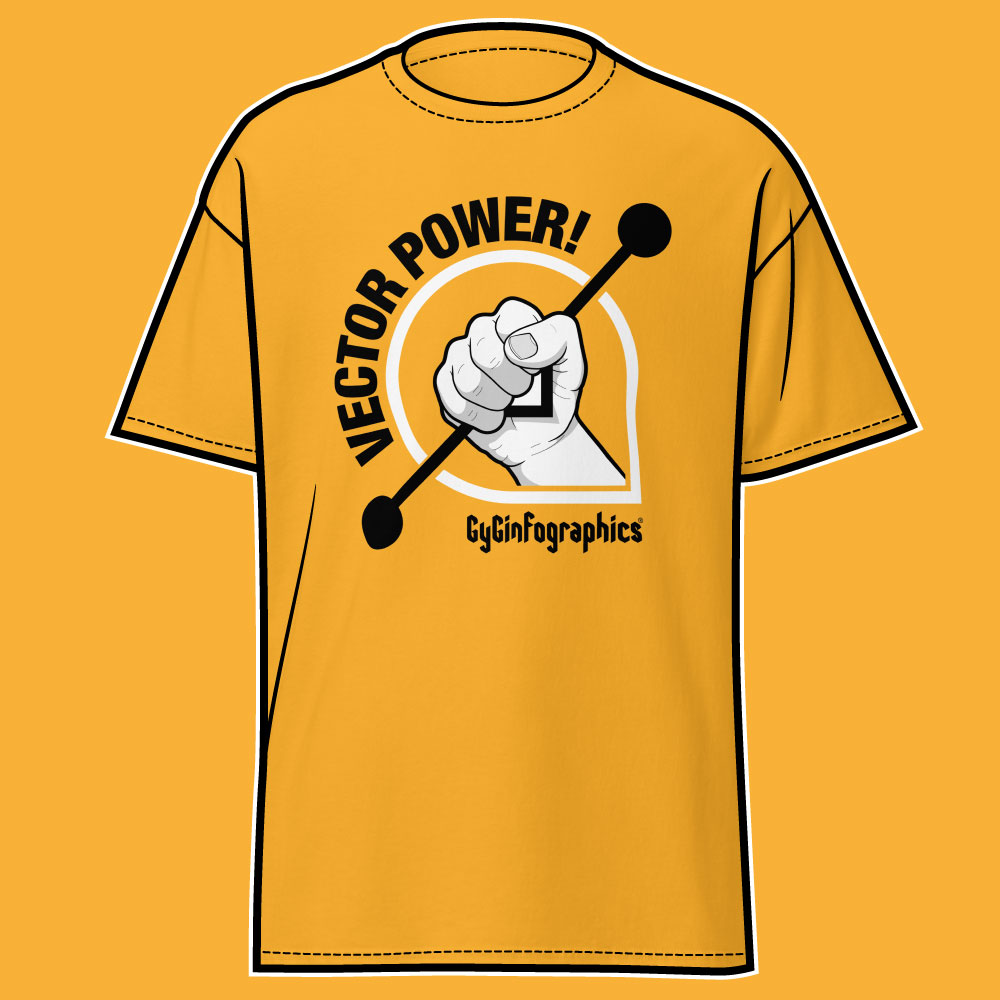
Very soon you will be able to buy the official t-shirt of the vectors «Vectors VS Píxeles» in my online store! GyGinfographics.shop.

